

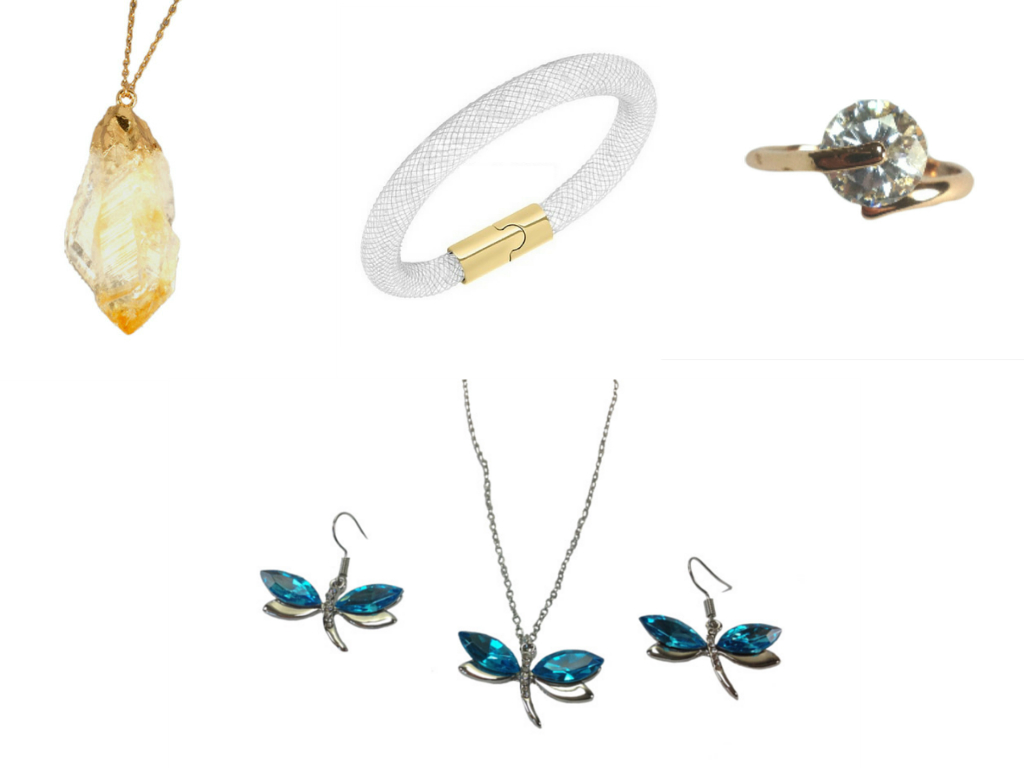
It’s been a while since we were lucky enough to host a competition with the lovely Narovia Jewellery but it’s most definitely been worth the wait as we have a beauty up for grabs for you – but before we get to that how about checking out some of the latest and greatest items they have for sale!
Natural Topaz Necklace
This gorgeous necklace is a sight to behold, made from around 2 inches of real rough topaz stone it features 18k gold plating and hangs on a lovely 17″ rolo chain with lobster clasp.
Galaxy Dust Crystal Bracelet
This beautifully modern bracelet features white mesh surrounding crystals which is fastened with a yellow gold plated magnetic clasp.
Dragonfly Set
I have featured the dragonfly earrings before and they were most definitely a favourite so it’s nice to see them available in this set along with matching necklace.
Ocean Diamond Ring
One of the newest rings to the collection is this beautiful highest quality cubic zirconia ring. Which is delicacy in cased with a rose gold finish.
All of these four wonderful products come with a free gift box.
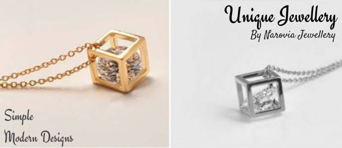
But check out what we have to giveaway to one of you lucky people the gorgeous 3D Cube Necklace in the colour of your choice!
To be in with a chance of winning all you need to do is let us know:
What improvements would you make to the Narovia website?
*Please note this competition has been ended early as Narovia are closing down and they wanted to make sure someone received a prize – I am sorry for any inconvenience this has caused but the circumstance are out of our control.
Good Luck

Would have more search options available
It is too ‘white’ and I would have a special Valentines section too.
I would refine the search engine
Just stumbled across this blog and have just registered, I have my blogger L plates on, but first impressions are that the text is very pale, so much so that I couldn’t see the text boxes on the registration page. Hoping to pick up lots of tips!
In the ‘about’ page of the Narovia website, there is a sentence that has a missing apostrophe and doesn’t make sense ‘Dont for get tho subscribe to our newsletter just create an account at Narovia jewellery’.
I like the layout of the website – very clear.
A review Page 🙂 Would love to be considered for this gorgeous prize x
I would change to back ground colour doing that would give it a more classy look.
I think its fab! Maybe add more products?
A more comprehensive search option?
Bolder colours and more defined sections to find specific jewellery for specific occasions.
When you hold your mouse over the menu items on the drop down lists, it doesn’t highlight, so it looks like it is not working. I’d definitely fix that.
Definitely change the background colour to something less white. Otherwise a great site!
Background colours
More colourful!
It looks clean and bright but I agree that the white sometimes is overpowering. I’d love to see some body jewellery added to the stock.
a bit more colour but other than that its fine
I love photographs on a white background, but always good to hover over the pictures and see the pieces in a model, also I’m not a fan of the grey banner at the top
Like to see jewellery on models to see actual size
Put more colour in the pages
Well, I’m not a web designer, so it seems a bit rude to comment, but I don’t understand why collections is split by item, not by design
Yes Please
It needs more photos of the jewellery being worn.
I would possibly put less photos on the home page. There are quite a lot of pictures plus the moving banner pictures at the top and its quite over powering all at once. But overall the webiste looks fab and really easy to navigate! x
I would subtly add a splash of colour.
Background colour definately
I am a web developer and I quite like the website layout however, the home page is cluttered and I agree with other people on here about the pictures not giving people an indication of how it looks worn.
Few other things include: Far too many advertisements and Unnecessary wasted space.
Hope that helps. Gorgeous Jewellery by the way.
I think I’d re-think the background – the white is a bit glare-y
Struggling to find a negative but I thought the images on the home page were a bit too large
I would make it more colourful!
Refine the search engine. Everything else seems great xx
Would like to see more models wearing the jewellery.
More colour would be good 🙂
I agree with above posts. More bold colours on the website to make a statement
i would make items slightly cheaper so I could buy more things
i would like to see some pretty wallpaper, but otherwise everything is beautiful xx
perhaps more comps
more colour
Bolder colours, it’s all very bland
3D Model Of Jewellery 🙂
Add more colour to the design!!
I’d like to see more photos, especially with the jewellery being worn
A bit more colour
Its too white, maybe some soft colours in the background, the products are beautiful.
have more competitions !!!
More picture of the jewellery would be good
more pictures of the jewellery would be good
More colourful pages
i wouldnt change a thing.
If I was being super picky I might put in a filter facility so people can filter metal colour, stone colour and maybe size
More colourful!
More colour 🙂
I think I’d make the design a bit less stark. I understand it does make the jewelry stand out more, but i also doesn’t keep interest for long.
I like the white background (unlike other reviewers) but I would want to know what the P&P charges are, and methods of payment.Ok- I see shipping prices are included in the FAQs but £6 is quite pricy for a £12 necklace. Also, put all the different methods of payment in the FAQs as I like paying by paypal.
I really like it the way it is, I like the white unlike other reviewers, I think it makes the colour of the gemstones stand out.
It needs more photos 🙂
More colour 😉
I would change the background colour to a warmer shade to make it more vivid.
Definitely the background colour
The banners on the homepage slider could use a better design without pixelated bits. I’d of course suggest they hire me to replace them. 😉
More vibrant colours would be nice 🙂
I’d add filters by size, metal etc. but more importantly I’d have the pieces modelled so that the customer can see how they actually look in ‘real life’. How many of us have been disappointed when we get to actually see the product?
Item reviews would be useful. Other than that I like the layout.
I would change the shopping “cart” to “basket” because if I see cart I think I’m on an American site, and stop looking!!
More competitions to win the lovely things on site please!
Little bit more colour in the background. Fab site tho x
more products?
more interesting design colours etc
More Colour needed
I would change the search engine
A Change of the background colour would be good.
A bit more colour
It’s only too white for me.. the rest is ok
I would add more colour 🙂
A colour
It could be a bit more colourful
Header is a bit basic
yes, definitely would change the white background, it’s just too stark
I would make the header a bit bigger as the brand name and logo don’t stand out.
a way to sort the jewellery into categories (for example material : silver, gold or stone type/colour, or earring type) to make it easier to find what you are looking for
Grey text can be hard to read if eyesight isn’t great
Keep the photos with a white background but add colour to the overall background. Make clearer dividers on the front page between the sections.
I’d like the ability to view all sides / angles of the jewellery
I would make everything free!!!!
HaHa brilliant, that made me laugh out loud
I can’t see anything to add to it, it has lovely pictures of the jewellery, great clear prices and categories that are easily found.
I would get a professionally designed header for the top of each page, probably a classy black and gold band across the top with your logo in white, something minimalistic and simple but very smart looking. 🙂
maybe a video of the products?
I would make a header bigger
I would put some colour into the website, the white is a bit too starchy and clinical looking.
I’d like the p&p more obvious
To be honest, nothing! I just tried to look at it with a really critical eye but I think it looks great…
Check text for spelling mistakes as there are several!
would arrange jewellery by colour and gems
brighter with more pictures
change the search enine and background colour
More Sparkle!
Just a smidge of colour
I’d tone down the background a bit – it’s very bright
bit more colour
more photos – perhaps with netrel backgrounds to make product stand out more
i think it looks great as it is!
some item reviews
a colour change x
Background shading would be good
make it bolder 🙂
To be honest I actually thought it was perfect. It was easy to navigate and the cart system was simple which is always a bonus
i thought it was alright
Bit too white and I’d maybe make the actual company logo stand out a bit more as it’s somewhat swamped by text
Larger imagery, more imagery, 3d views.
More options on the search bar
Inject some colour onto the site.. it’s too white and clinical. It needs a splash of colour!
Maybe more sub-categories eg. when searching for necklaces maybe add filters like price/length/colour etc. Apart from that I loved the site, it was simple and not over-fussy
I don’t know i’m too busy laughing at the make everything free comment above
Bolder colours if I may be so bold!!
Maybe just a different, more eye-catching font for product names (the clickable link)
There’s a lot of pictures on the first page which makes it a little slow to load on my old laptop.
Add more colour